
Prevent Blindness
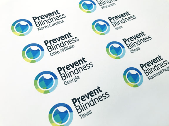
Commissioned with a brand and identity update, Flockhart Design was charged with developing a logo that was dynamic, would have consumer appeal, and be distinctive yet relatable. We developed a logo that visually highlighted the preventative component of eye health set forth in their mission. Using a mosaic of colors, the mark conceptually reflects the center of an eye, and the multi-faceted aspects of the organization and its initiatives/advocacy. The mosaic is also meant to reflect themes of inclusiveness and diversity.