
brand strategy.
An organization’s brand identity reflects its inherent personality. Consequently, organization messaging is a crucial element of the external communications program, marketing/ collateral materials, the web site, product/service literature, promotional and recruiting campaigns, etc., and must be carefully planned and executed to be consistent with the organization’s identity system and communication plan. It should establish a direction that encompasses core values and objectives, and considers target audience. It is important for us to remember that each component must work within the communications “family” as well as on its own.
Below are just a few examples of partnering with our clients to develop successful integrated brand initiatives.
Prevent Blindness
With a history of over 100 years, Prevent Blindness is the nation’s leading non-profit public eye health organization focused on improving the vision health of communities through education, health promotion, policy, research, and advocacy.
We teamed up with the organization to review a name change as well as a brand update that would be more reflective of their current mission and values. Concerned the existing name was no longer reflective of the broad array of vision care initiatives and services the organization promotes, our first exploratory initiative was a naming analysis. Through research, interviews and survey’s with a wide audience of stakeholders, constituents, donors, partners and the public at large, we determined the name possessed brand equity and recommended maintaining the current name. We did however, work to update the brand and its messaging to be more reflective of its mission, and appeal to a broader consumer market.
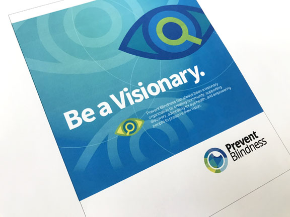
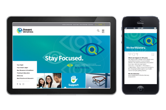
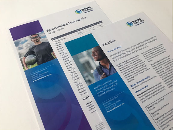
To support this messaging, the logo visually highlighted the preventative component of eye health set forth in their mission. Using a mosaic of colors, the mark conceptually reflects the center of an eye, and the multi-faceted aspects of the organization and its initiatives/advocacy. The mosaic is also meant to reflect themes of inclusiveness and diversity.
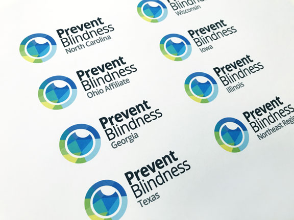
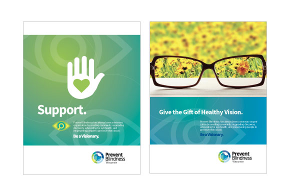
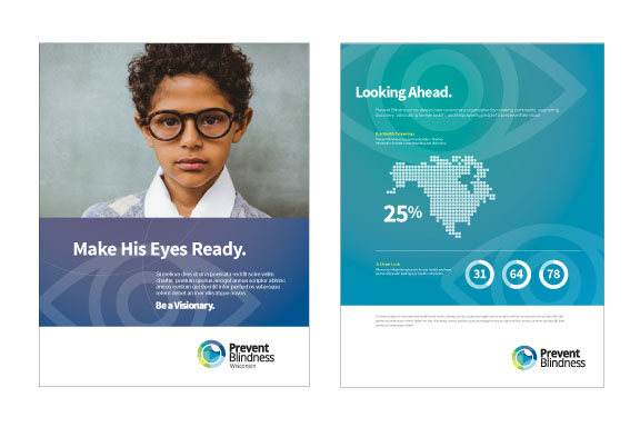
The new brand launch was paired with a campaign and website design developed by Flockhart Design. Building brand credibility, we considered how their audience and entities experience and convey the brand. We strategically controlled and influenced interaction to create a positive brand impression with an effective and successful campaign launch message: “We Are Visionary”/“Be A Visionary”. With deployment at a national and affiliate level, this aspirational message positioned them as a visionary organization and industry leaders, creating community, supporting discovery, advocating for eye health, and empowering people to preserve their vision.
Our branding scope of work included:
> Brand Development
> Logo/Identity Design
> Naming Strategy & System
> Brand Style Guide
> Corporate Stationery
> Website Design
> Brand Campaign
> Social Media Strategy
> Brand Campaign Style Guide
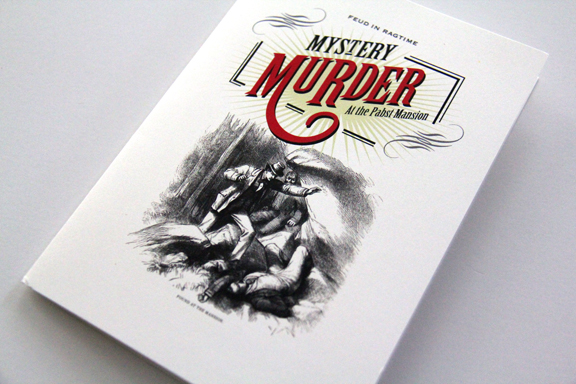
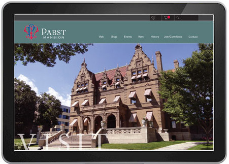
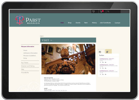
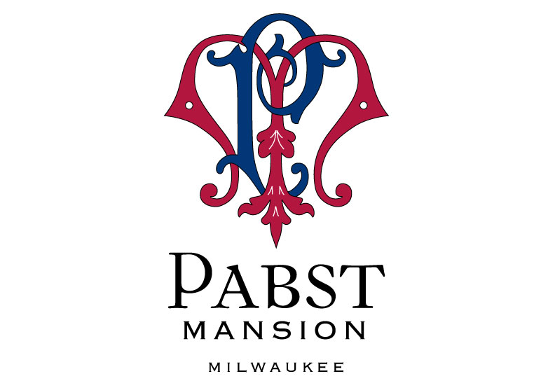
Pabst Mansion, Milwuakee
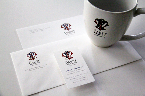
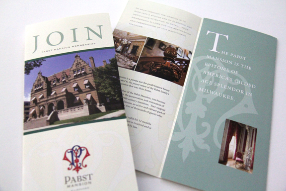
Built by the famed brewing family and completed in 1892, the Pabst Mansion is a meticulously restored house museum that is the epitome of America’s gilded age splendor. Located in Milwaukee, Wisconsin, Flockhart Design was commissioned to develop a new brand that was reflective of the era and the museum’s mission. Executing a monogrammatic approach, the letterforms were intertwined and inspired by period typography. Colors were selected as an homage to the Pabst Brewing Company corporate colors. Combined with upper-case letterforms, the overall visual effect is historically influenced, elegant and graceful.
Our branding scope of work included:
> Brand Development
> Logo/Identity Design
> Brand Style Guide
> Corporate Stationery
> Website Design
> Membership Collateral
> Application to Merchandise
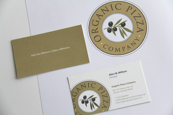
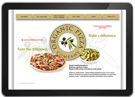
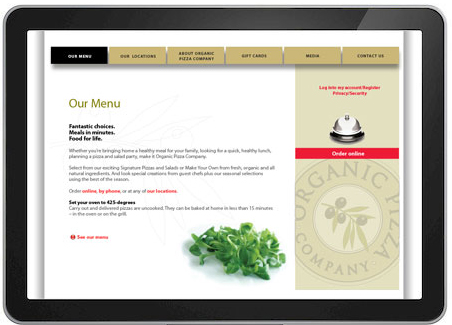
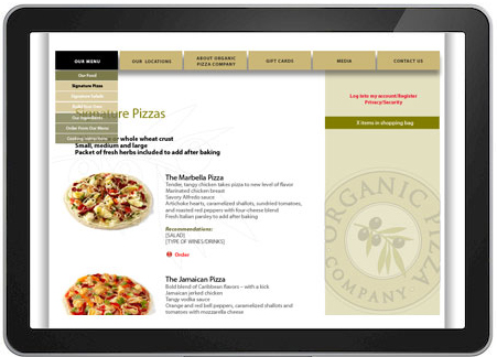
Organic Pizza Company
Charged with developing the brand and the name of this Denver based restaurant, in addition to conveying the quality of ingredients used in their product offerings, the concept was to create a mark that balanced elements of old-world Italian with a fresh and modern approach. Infusing social responsibility into their mission, all packaging was made from recycled materials and a portion of all profits were given back to the community. This became the inspiration for the tagline we also developed, “Taste the Difference, Make a Difference.” Paired with the identity, the modular elements could stand alone or be combined to convey to customers not only the quality of food, but also their ability to feel good about their patronage.
Our branding scope of work included:
> Name Development
> Brand Development
> Logo/Identity Design
> Tagline Development
> Brand Style Guide
> Corporate Stationery
> Website Design